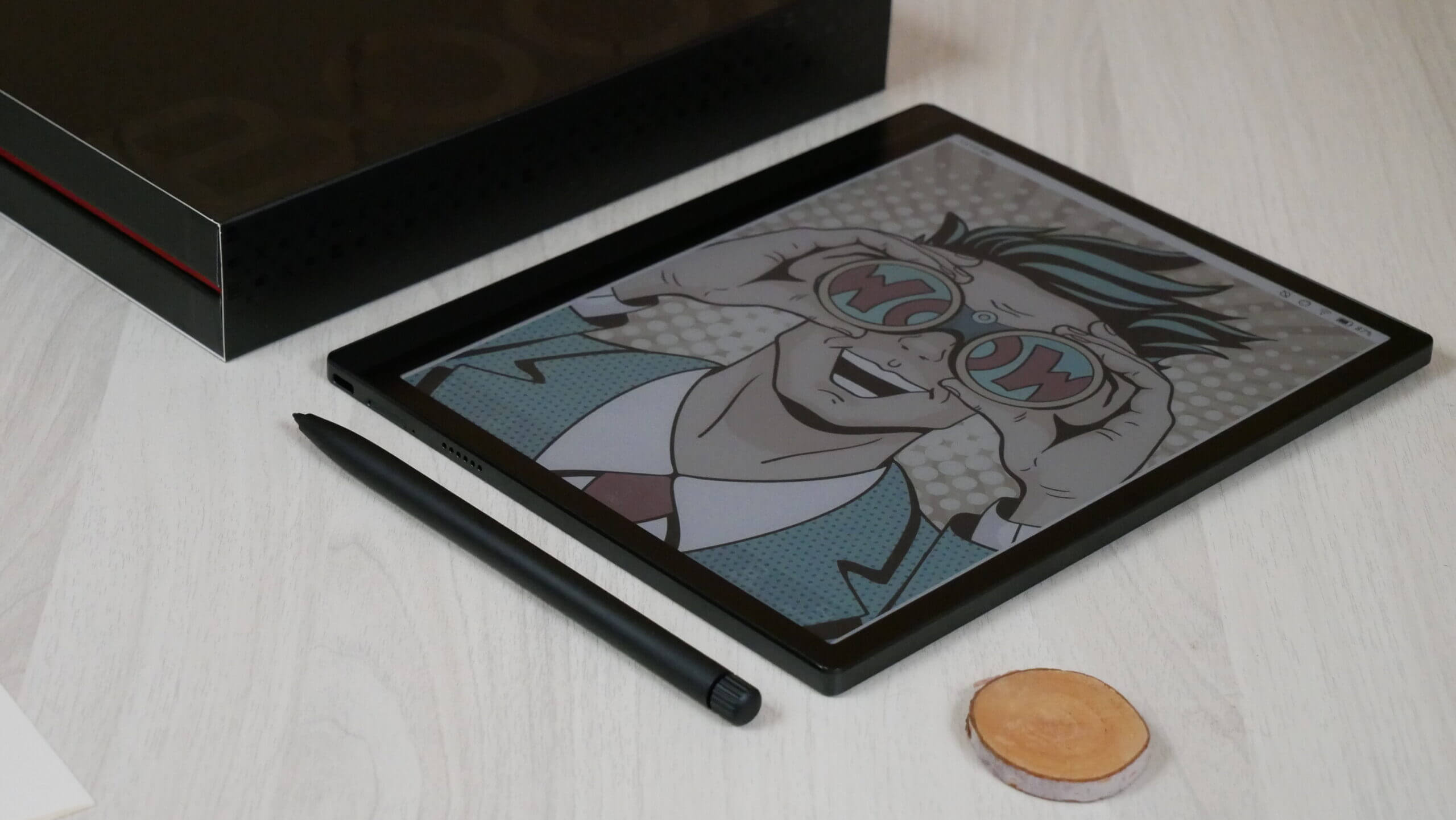
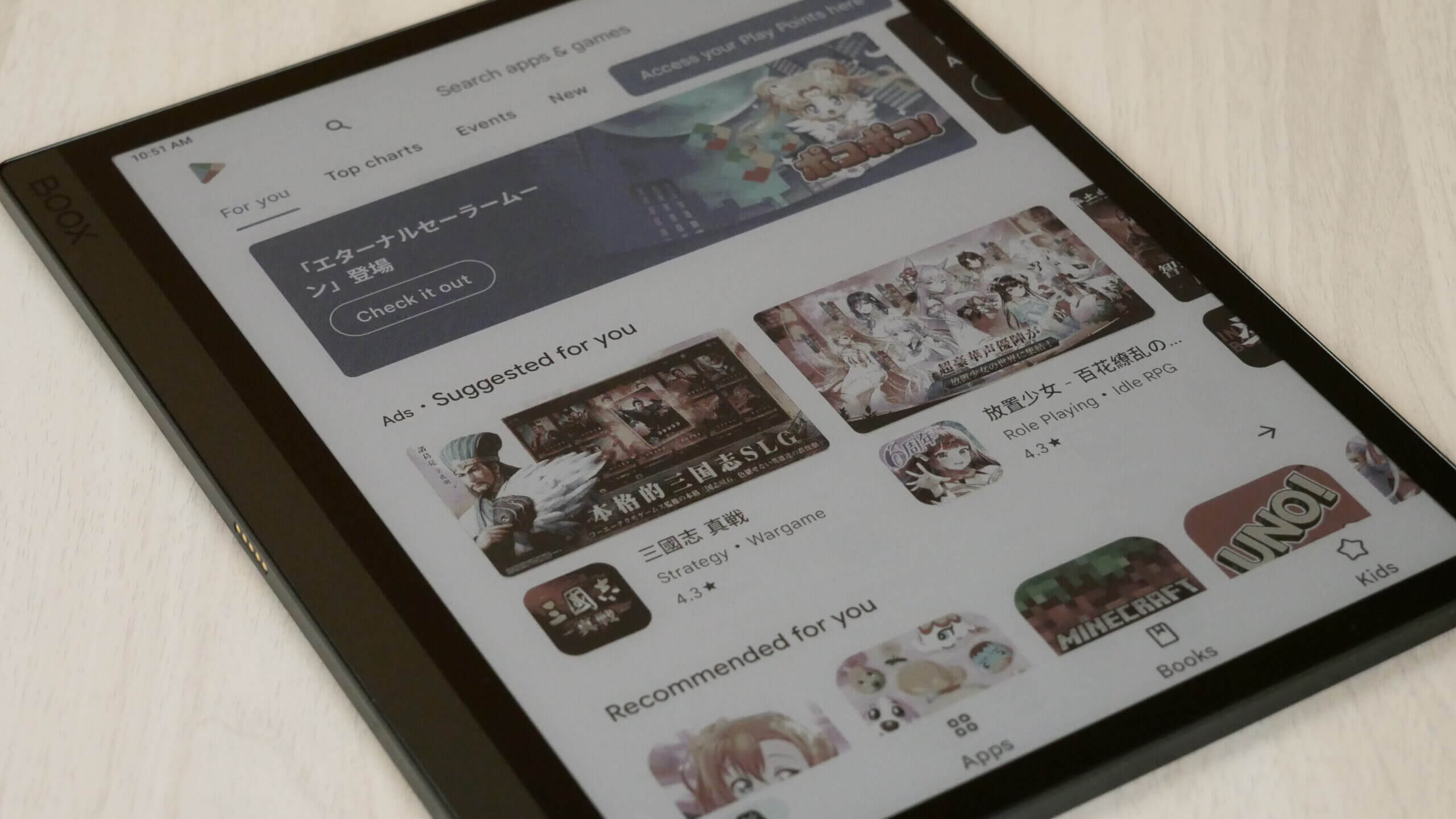
The Onyx Boox Tab Ultra C is gearing up to be one of the year’s most prolific digital note-taking tablets of 2023. It employs the latest generation colour e-paper screen technology, Kaleido 3. The screen can display over 4,096 colour combinations at 150 PPI; black and white content, such as ebooks or PDF files, will give you a glorious 300 PPI resolution.
The Tab Ultra C, at its core, is more of a multimedia tablet than a traditional e-note or e-reader. You will not get the same refresh rate as an iPad, but it is close. Numerous speed modes are built into the Android 11 operating system. When browsing Google Play, visiting your favourite website, watching YouTube videos or streaming music, the speed modes will handle anything you can throw at it; this is unique for an E INK screen. Four-speed modes; can be changed on the fly or associated with a specific app, so that app will always have the speed mode you want without changing it constantly.
Kaleido 3 provides the best colour experience to date. The Tab Ultra C provides users with a truly capable e-note designed to freehand draw, develop character art or view and edit PDF files. Dozens of colours can be employed to put the stylus on the screen, providing a unique experience. The ebook cover art will be full of vibrant colours, and ditto with comics, magazines and replica newspapers.
At the time of this review, only one other tablet on the market is using Kaleido 3, which is Bigme with their Inknote Color+. They are an excellent company that designs great products. However, Onyx has been crafting e-readers and e-notes for over ten years and has an extensive track record of supporting new and old products with firmware updates. You can invest in an Onyx device and get updates for at least 5-6 years after its sale. You will get this type of value out of the Tab Ultra C.
Hardware
The Onyx Boox Tab Ultra C features a 10.3-inch E INK Kaleido 3 e-paper screen, and it uses the latest generation E INK Carta 1200 panel, which should keep things snappy. The B/W: 2480 x 1860 (300 PPI) Color: 1240 x 930 (150 at PP). The screen is flush with the bezel and protected by a layer of glass. It has a warm and cool light system, allowing users to read in low-light environments or at night.
The 3rd generation colour e-paper, E Ink Kaleido 3, offers richer colours, increasing its colour saturation by 30% compared to the previous generation, E Ink Kaleido Plus, in addition to 16 levels of grayscale and 4,096 colours. Kaleido 3 also supports E Ink ComfortGaze, a new front light technology that reduces the amount of blue light, with a reduced Blue Light Ratio (BLR) and Blue Light Toxicity Factor (BLTF) by up to 60% and 24%, respectively. BLR is the toxic blue to total blue light output ratio, and BLTF is the brightness to hazardous blue ratio. Additionally, the responsiveness of the ink means that Kaleido 3 can play animations and videos.
The last few generations of colour e-paper could only display 4,096 colours at 100 PPI. Kaleido 3 managed to increase the colour accuracy to 150 PPI. This was accomplished by putting the Color Filter Array closer to the ink layer. E INK made further updates to the print pattern; in the past, they used glass and switched to plastic. Black and White PPI using Kaleido 3 can display 300 PPI, and the background is grey, instead of Kaleido Plus, which mixed colours to create grey.
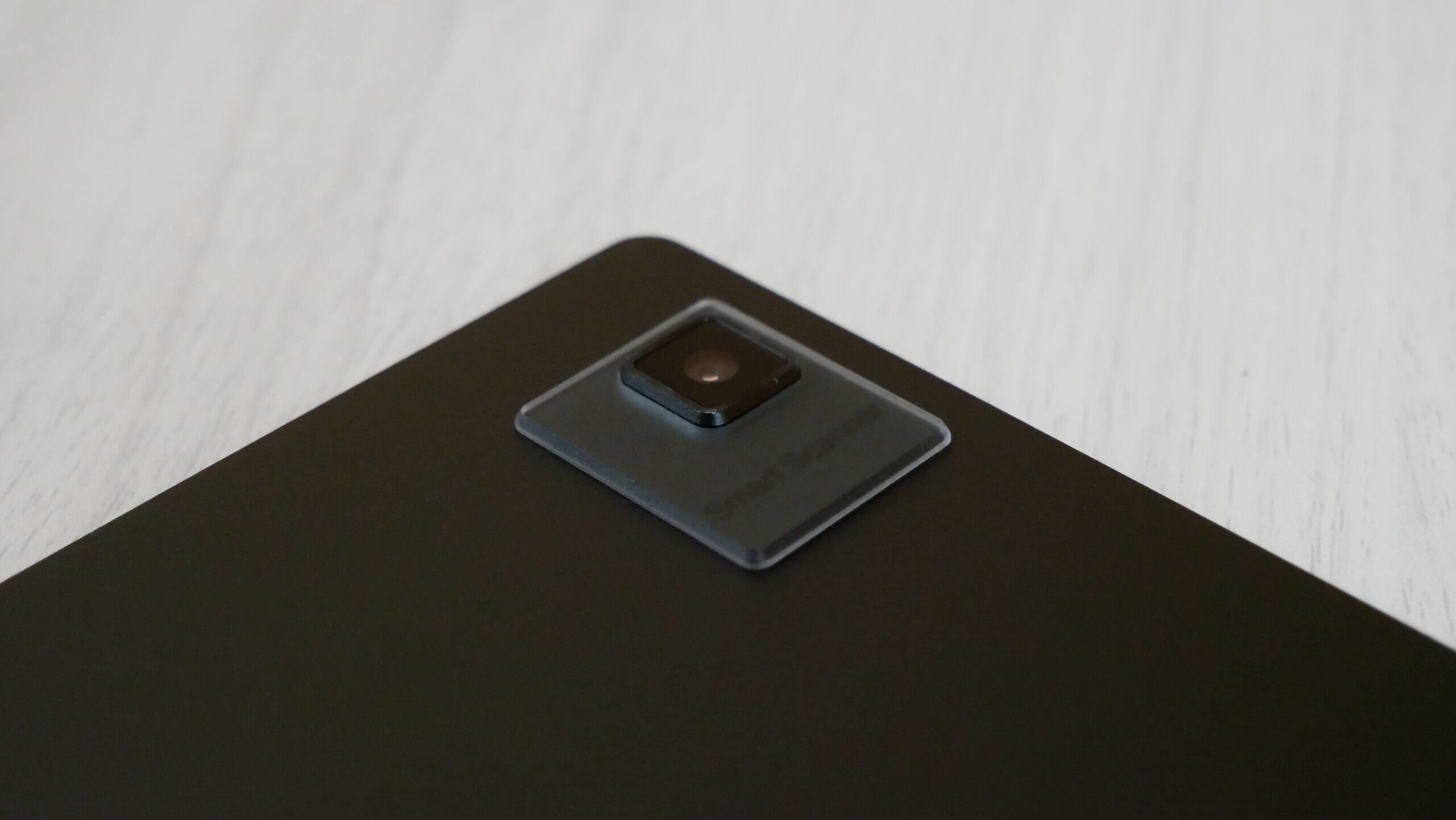
Underneath the hood are a Qualcomm Advanced Octa-core 662 processor, 4GB of RAM and 128GB of internal storage. This is more storage found on most e-notes or e-readers currently on the market. Moreover, it has an SD card with an additional 1TB of storage. There is a G-sensor for Auto Rotation, making it easy to flip from portrait mode to landscape mode. Landscape works well for split screen view or using the optional keyboard to write using the new Onyx Writing tool. On the rear of the device is a 16MP Rear Camera with OCR. The power button is used for putting the device to sleep, but it also has a fingerprint scanner for added security. USB-C is used to transfer data to your Tab C and also for charging. Dual speakers will provide ample audio for playing games, listening to music, audiobooks or podcasts. It also has Bluetooth 5.1 for wireless headphones or earbuds if it’s late and you want to avoid blasting the speakers. Power is provided by the 6,300mAh Li-ion Polymer battery, which should be suitable for a couple of weeks. The dimensions are 225 x 184.5 x 6.7 mm and weigh 480g.
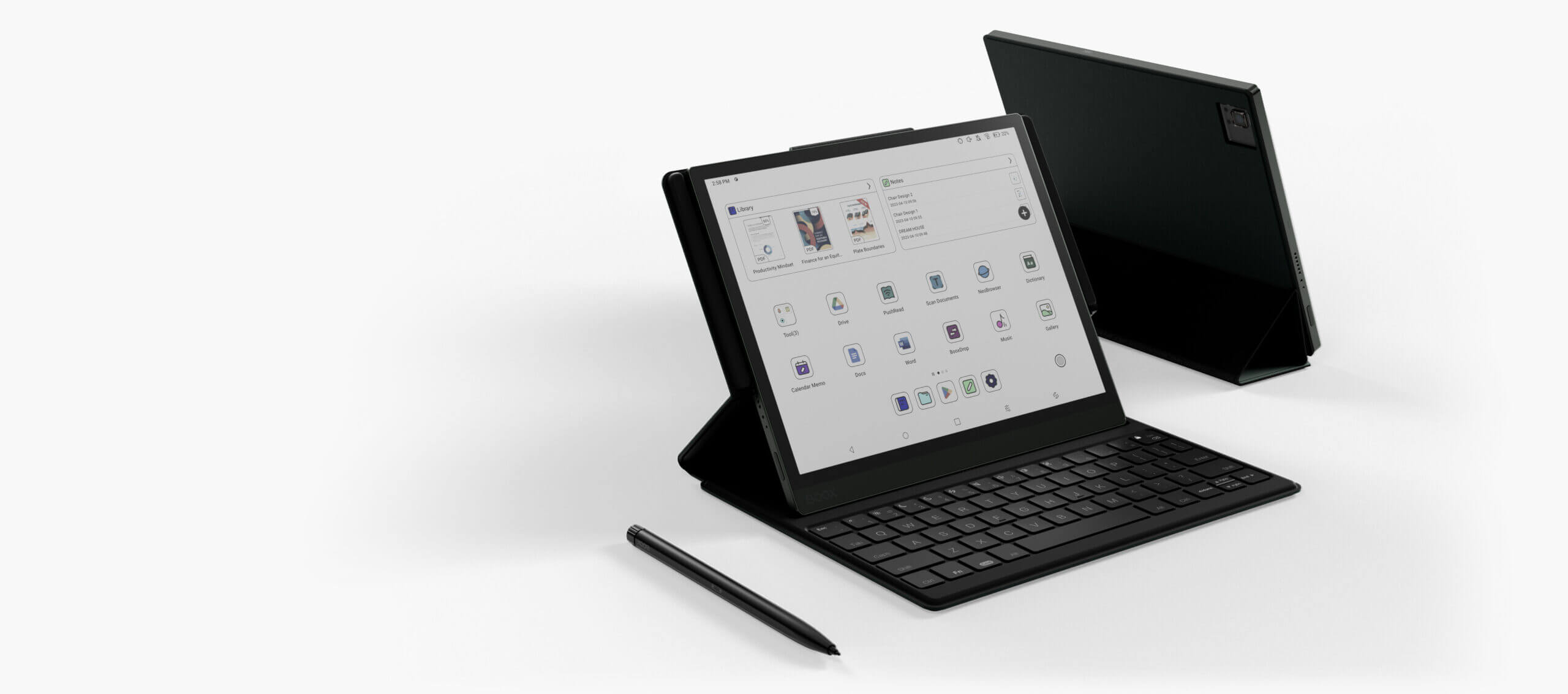
There are a few added peripherals that transform this tablet into something better. There is a customized case with a full QWERTY keyboard. This magnetic case with a built-in keyboard is exclusively designed for the Tab Ultra. It makes working more effortless. Attach the keyboard to the device through pogo-pins and then you can start typing away. It requires no power or Bluetooth. There are numerous helpful keyboard shortcuts for quickly adjusting the front-lit display and warm lighting. Control the volume or even do a full page refresh. It retails for $109.99 and is relatively affordable; it can be purchased from the Good e-Reader Store.
The gold standard for modern e-readers and e-notes from companies like Amazon, Kobo and Barnes and Noble is 16 levels of grayscale for their black and white e-paper display screens made by E INK. This means there are 16 different levels of grey, including black and white text. You will notice the shades of grey when looking at pictures, such as those found on PDF files or browsing the internet with the experimental browser. This year Onyx pushed out a new firmware update that managed to increase the grayscale with dithering enhancements on a software level from 16 to 256 levels.
There is no magical e-paper technology that has a higher level of grayscale. They use simulation to do it via dithering algorithms on a pure software level. This is how they can bypass the 16 levels of grayscale and instead use 256 levels. Instead of having 256 levels of grayscale on specific applications, such as the PDF rendering engine or the ebook reading app, all these companies managed to make it system-wide. Every navigation entry, text, or image will look sharper without fuzziness or antialiasing issues. On a basic level 256, it smooths over any pixelated sections caused by gradient scaling. In conjunction with K3, all menus, ebooks, comics, and magazines will look amazing.
Software
The Boox Tab Ultra C is running Google Android 11 and has full access to the Google Play Store, which is preinstalled. Users can sign into their account and start downloading apps that have already been downloaded or purchased on other Android phones or tablets. Onyx is running Boox OS, which is a customized launcher that is an optimizer for e-paper e-readers, e-notes and tablets. The company constantly pushes out firmware updates to refine the reading, writing and general performance. They do this every few months, which is suitable for users who can invest in the Onyx platform, knowing that it will be supported for at least five years.
This is the fastest Onyx product we have ever reviewed. If you launch an app, it automatically opens. Navigating around Google Play is instant; even animations play correctly. Browsing the UI and settings menu is lightning-fast. This is with the standard speed model too. I don’t know what Onyx did underneath the hood on a software level, but compared to the Leaf 2 with Carta 1200 or the Nova Air 2, this blows them out of the water with performance. You have to watch our YouTube review at the bottom of the post to appreciate Onyx Boox’s advances with the Tab Ultra C.
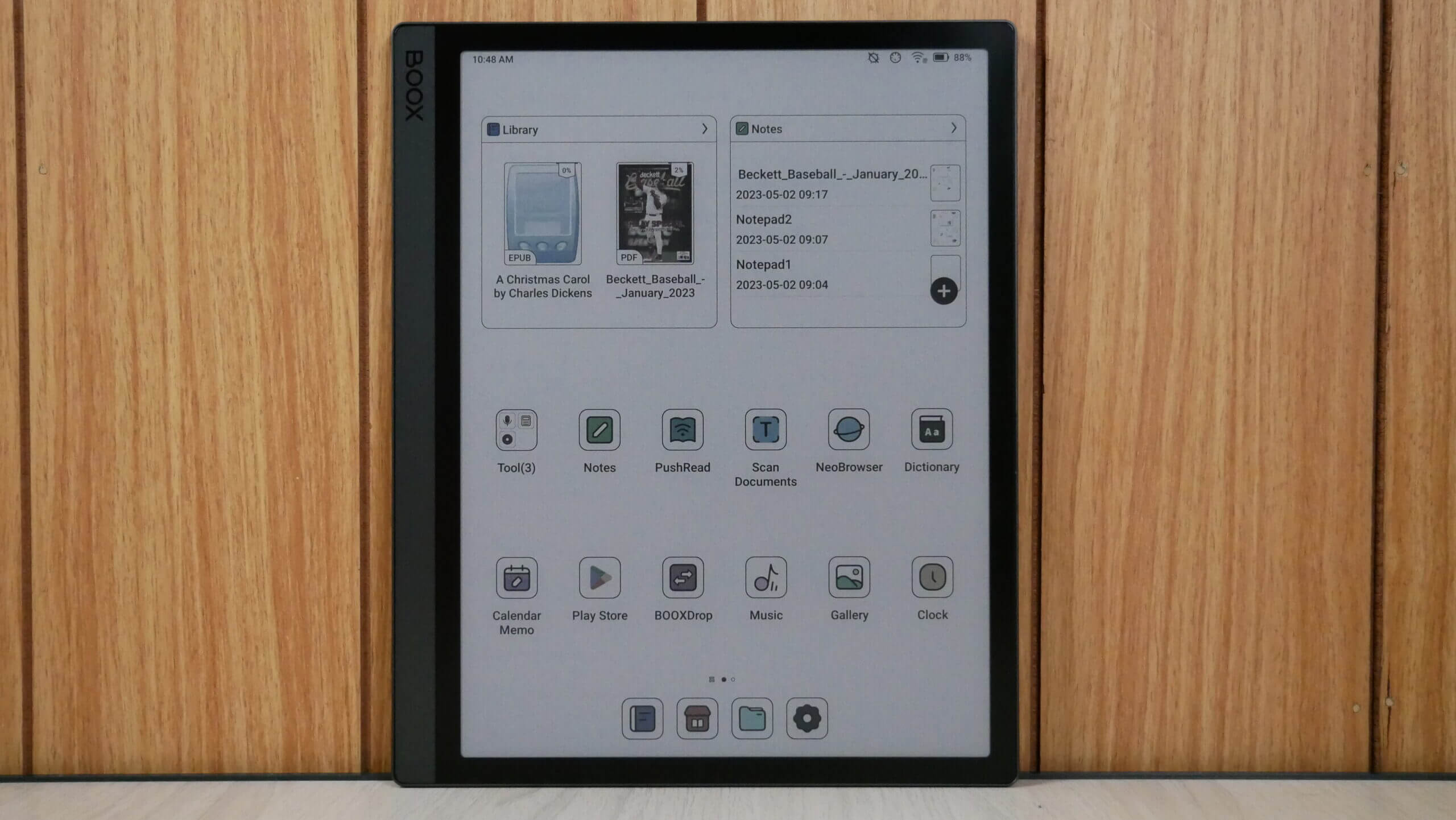
Onyx has a brand new user interface for the Tab Ultra C that is not found on any other Onyx Boox product. The navigation bar is on the bottom, and the UI elements change, depending on what you have open, such as the Note taking app, reading app, Google Play or the internet browser. The home screen gives shortcuts to the library, note-taking app, file browser, and settings. You can click on things to launch specific elements, supporting gesture control. If you swipe upwards from the bottom of the Ultra, below the icons, you will automatically go to the home screen. If you swipe down from the top, you get the typical Android notifications. Swipe downward where the WIFI and click symbol is, and you will launch the main settings dropdown menu. If you long press on the main home screen, you can now add widgets, which is exciting. There are a few stock ones, such as calendar, weather and clock, but you can download additional ones from Google Play.
The main dropdown is called Control Center. This is where you can establish a WIFI network, Bluetooth connections, access the E INK Control Center, rotate, screen cast, mute notifications, enable/disable the touchscreen, split screen view, screen recording, Boox Drop, Screenshot, Do Not Disturb mode and screen refresh. You can also adjust the volume of the two stereo speakers or if you are using Bluetooth headphones. The front light and colour temperature system can also be changed here. A tiny gear setting also allows you to enable or disable any of the options listed here on the Control Center.
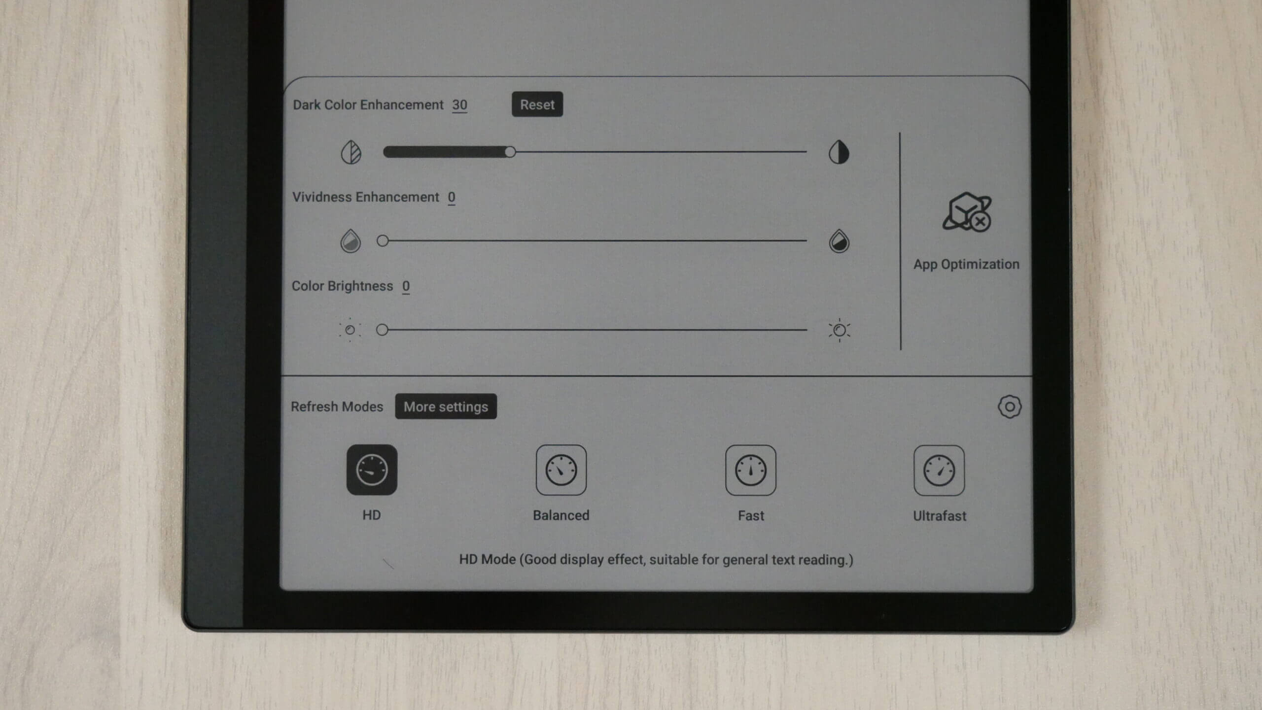
E INK Control Center is beneficial. You can control the dark and light levels of the entire device. This helps with contrast. I prefer to have the icons and text slightly darker than the default setting. You can also augment the light and dark values per app. So, you downloaded the Kindle app but found the UI and text a bit dark. You can access the Control Center, adjust the darker values, and they will always be there whenever you launch the app in the future.
Onyx has changed the naming conventions of their speed modes. They are now called HD, the default standard, and Balanced, which gives you a nice blend of increased performance with slight image degradation. Fast offers kick the Ultra into overdrive, making it even quicker. At the same time, Ultrafast is ideal for watching streaming video or listening to audio, from sources such as YouTube or Spotify.
Onyx has also changed the settings menu. The main navigation bar is now on the right side, and all data from the fields is now on the right side. This gives you a standard Android interface. Some of the most notable functions here are controlling the new gesture controls and how you gesture to do specific things. You can swipe in particular ways to refresh the screen, which helps eliminate the ghosting from the faster speed modes. Desktop settings is where you can add your screen saver or power off images. The display is where you can change the system fonts and text sizes. Brightness, screen timeout, and auto sleep are also helpful. Onyx has added a new feature called full refresh frequency. This is controlled by tapping the screen with the stylus or your finger. The default value is 5, but you can change it to whatever you want; I like 3. So if you quickly tap the screen three times, no matter where you are on the device, the net will a refresh.
The Camera is out of this world. You can take a picture of a document or a book, and the OCR functionality will convert it to pure text. This text can be copied and pasted to the note-taking app or edited with any of the apps you have installed on the Ultra. However, you don’t exclusively need to use the camera to take pictures of books, but also selfies and all of these are stored in the devices picture folder.
Honestly, it is refreshing to see Onyx revise the user interface and settings and introduce tons of new features and enhancements. It just seems more dynamic. That stupid little ball that gives you quick shortcuts on most other Onyx products is not on this device, thankfully. I could never get used to it and disabled it, because it was annoying to look at, and I always clicked on it accidentally. Likely, these new changes will only apply to feature Tab series tablets.
Writing and Drawing
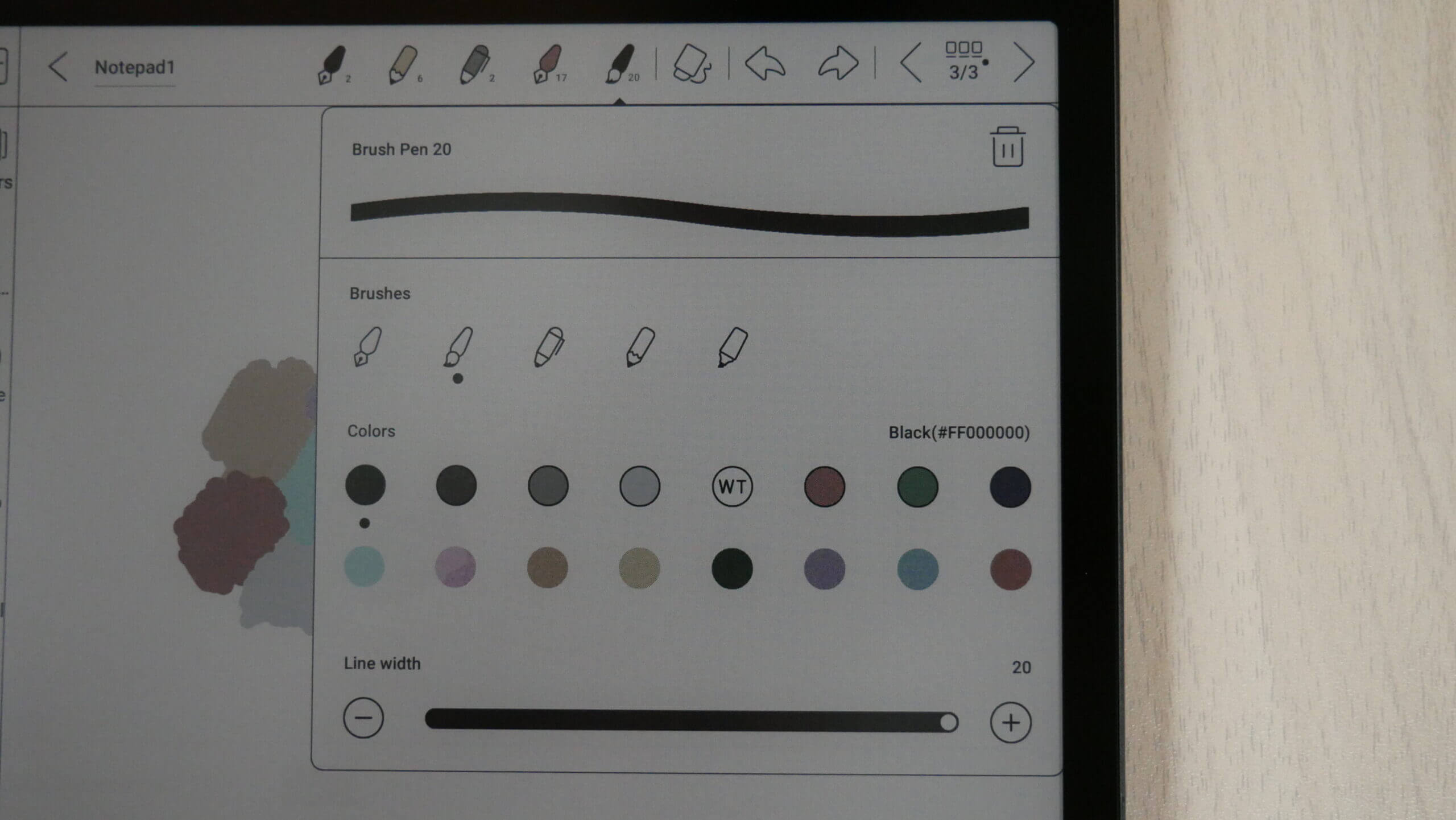
The Tab Ultra C is a dedicated digital note-taking device that allows you to draw freehand, make notes, or doodle in colour. Eighteen colour combinations can be selected, just the primary colours. When you are done drawing, you can save the notebook to the device, export it as a PNG or PDF file, and copy it to your PC/MAC. Once it is opened on your computer, you can view the document in all the colours you made.
When you want to draw something there is a slew of pens and pencils, and even other tools like a mechanical pencil and highlighter, fountain pen, paintbrush, ballpoint pen or text. There are also line thickness settings to get thinner or thicker lines, but don’t forget, the stylus has pressure sensitivity too.
One of the features I like is using layers. This system is similar to popular photo editing software such as Adobe Photoshop. As an essential feature that users frequently required, layers can help people take notes without ruining the templates and draw details while retaining the original layout. The built-in Notes app supports you to add up to five layers currently. As the template is the base layer, you can simultaneously have up to six layers. By selecting a template as the base layer, you can give your work comprehensive layout instructions. You can choose from local space, cloud space, or custom templates in png format to give a page a specific look.
But what else can it do? You can use screencast whatever is on your Tab Ultra C directly to your PC. This is useful during meetings or to show people what you have been working on rather than crowding around the e-reader. Onyx also has a companion app Android and they are working on an IOS version. This is optional to use. It lets you sync everything on the Ultra C to your smartphone or from your smartphone to the Note. Onyx also provides 10GB of cloud storage for everything in their cloud. You only need to use the companion app if you want smartphone integration.
There are a few important features worth mentioning. Documents can have 500 pages on them to have extensive notes. I also like saving your favourite pen settings to the entire UI, so you can select each one by tapping your finger on it or with the stylus. For example, Pen 1 can have a pencil with thick lines and be back. Pen 2 can be a highlighter with RED and thin lines; Pen 3 can be a brush with thick lines. I also like how you can import pictures from Dropbox or Google Drive right into the notes, resize them in a message, and edit them.
The A5 screen is perfect for editing PDF files. This is one of the big draws of purchasing it. You can start drawing on PDF files as soon as they are loaded and save the edited file as a different file name or overwrite the original. You get a different interface when editing PDF files than the standard drawing experience on the note taking app. Even with the normal HD mode, I have never seen an Onyx Boox product perform so well with PDF files. Page turns are instant, there is no latency, and it is like using an iPad. Suppose you try pinching and zooming a PDF, a small notification window popups and asks if you to turn the function on. Other Onyx models have this feature but are buried in various sub-menus.
With constant firmware updates, the Notes app provides even more powerful tools than ever. You can use handwriting recognition (AI tool) to quickly transform your handwritten notes into text. You can also insert recordings, pictures, attachments, and links to an internal page or an external website to make your messages look vivid.
Reading
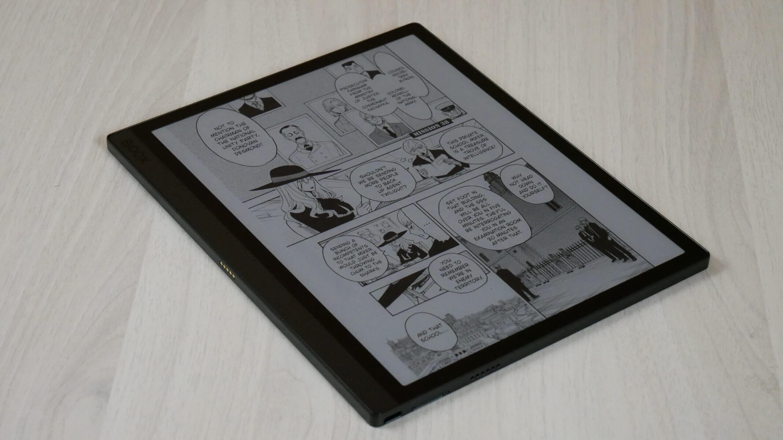
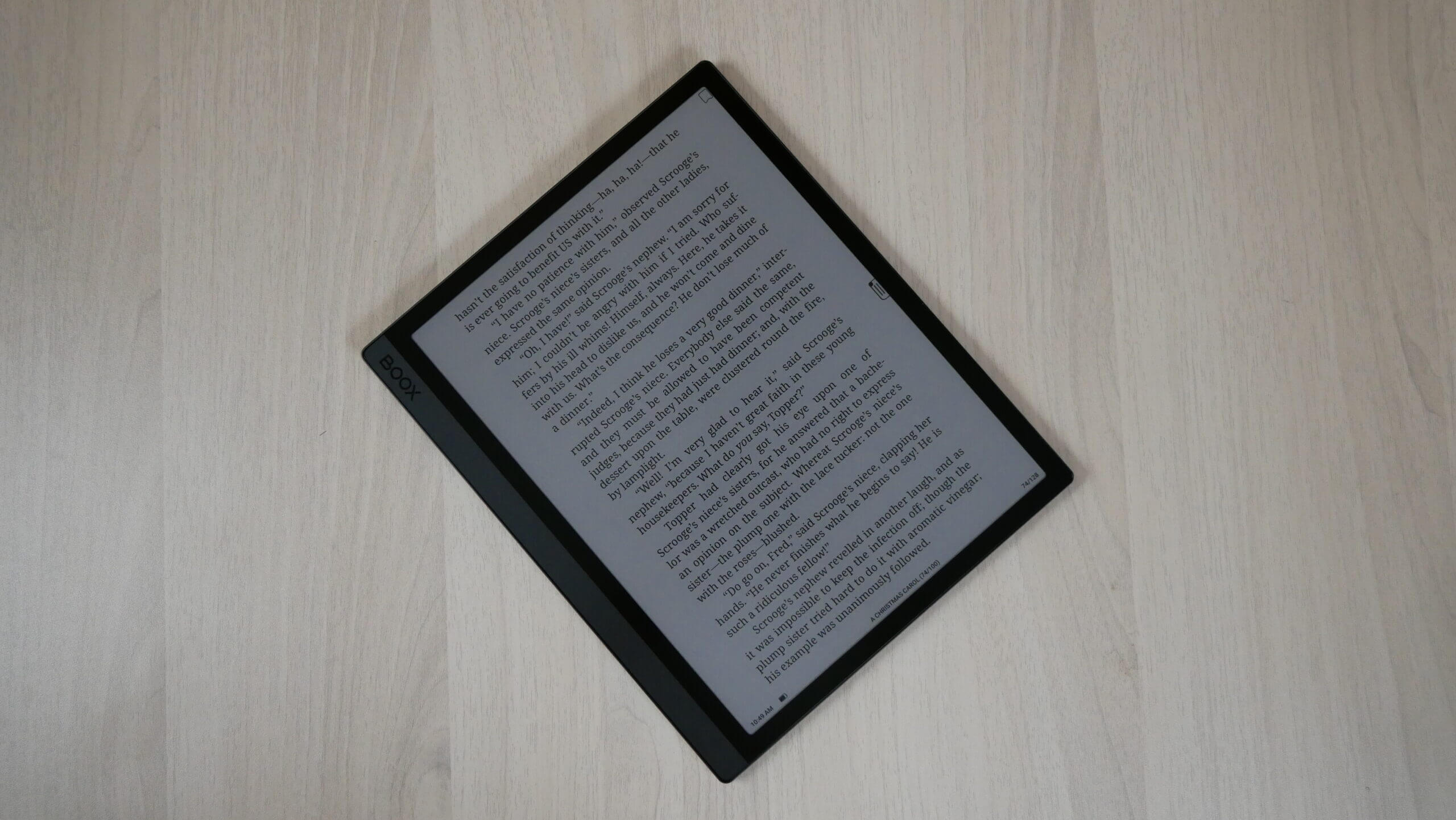
The Tab Ultra C makes a perfect e-reader to consume books, comics, manga PDF files and other digital content. This is because it has an A5-sized screen and a 10.3-inch display. There is tons of real estate for all text to fit evenly across the screen. Flipping pages is ultra-fast and even faster if you engage in any speed modes from the E INK Control Center. The image quality is very pronounced, so if you are looking for a multipurpose tablet to read, this one’s for you.
The e-reading experience starts with the stock app Neoreader;. It is where you can sideload all your content with many options for font sizes, font type, alignment, line spacing and margins. It supports PRC, RTF, Doc, Text, DJVU, PDF, Mobi, FB2, EPUB, CBR and CBZ. CBZ and CBR support is excellent for sideloading in Manga files since this is the most popular online format. However, Amazon delivers manga in AZW3 and Kobo/Google via EPUB. You don’t need to worry about forms if you install apps such as VIZ or manga apps.
PDF files are enjoyable, whether replicas from, say a Newspaper, Dungeons and Dragons source material or even a contract. You can quickly sign your documents with a flourish of the stylus or use your fingers for handwriting. You can quickly fill in boxes and write in fields. Manga is also excellent. However, your mileage might vary depending on whether you are using a dedicated app or sideloading your own content.
The Tab Ultr4a shines when you access Google Play and download your favourite apps. This gives you tremendous flexibility and freedom to use whatever reading or news apps you usually use on your smartphone or tablet. I know many people always install Libby to read eBooks or listen to audiobooks borrowed from the public library. The Kindle reading app is the most popular since it was initially developed for smartphones and tablets. The page turn animation always looks nice and pretty, but it really struggles on E INK devices due to the refresh issue. This is why Onyx made enhancements to the app on a system level to eliminate animated page turns, so it is seamless and robust when you turn a page. Over the years, they have optimized many other apps but tend to focus on the writing experience on their extensive line of e-notes.
Reading in colour is tremendous on the Tab Ultra C. Whether using sideloaded content from cloud storage or your computer or apps to access content, the colour is amazing. E INK has made great strides in refining colour e-paper, and K3 is the best. Your black and white text’s backgrounds are entirely grey, similar to the location of the Kindle or Kobo. Due to the 300 PPI, text looks razor sharp; there are no anti-aliasing issues.
Wrap Up
Regarding industrial design, the Tab Ultra C is the same thing as the Tab Ultra. The hardware and software are identical. So we have to look at the package as a whole, not its parts For example, the Tab Ultra C is a unique and well-built device, and the Kaleido 3 screen is the best usable colour E INK technology in the world. Put those things together, and you have yourself a winning combination.
(adsbygoogle = window.adsbygoogle || []).push({});
The post Review of the Onyx Boox Tab Ultra C – Kaleido 3 Color e-paper tablet first appeared on Good e-Reader.

