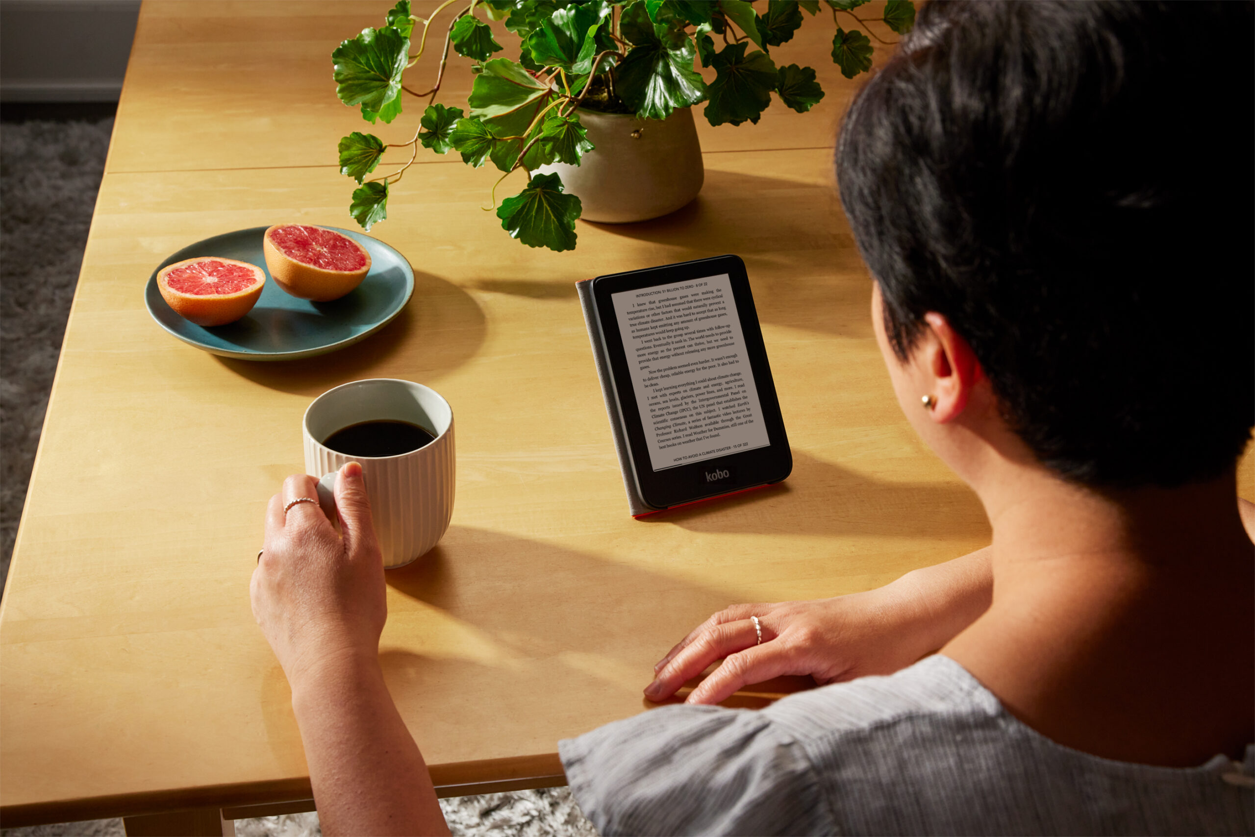
The Kobo Clara 2e is one of the most environmentally friendly e-reader in the world. The overall body is made of 85% recycled plastic, in addition to being 10% ocean. plastic. In keeping with this theme, it is waterproof, so you will be able to use it while lounging by the pool or reading in the bathtub. It is rated iPX8, so it should be good for up to 60 minutes completely submerged in fresh water. If you spill things on it, like coffee or tea, simply run it under the tap to give it a good cleaning.
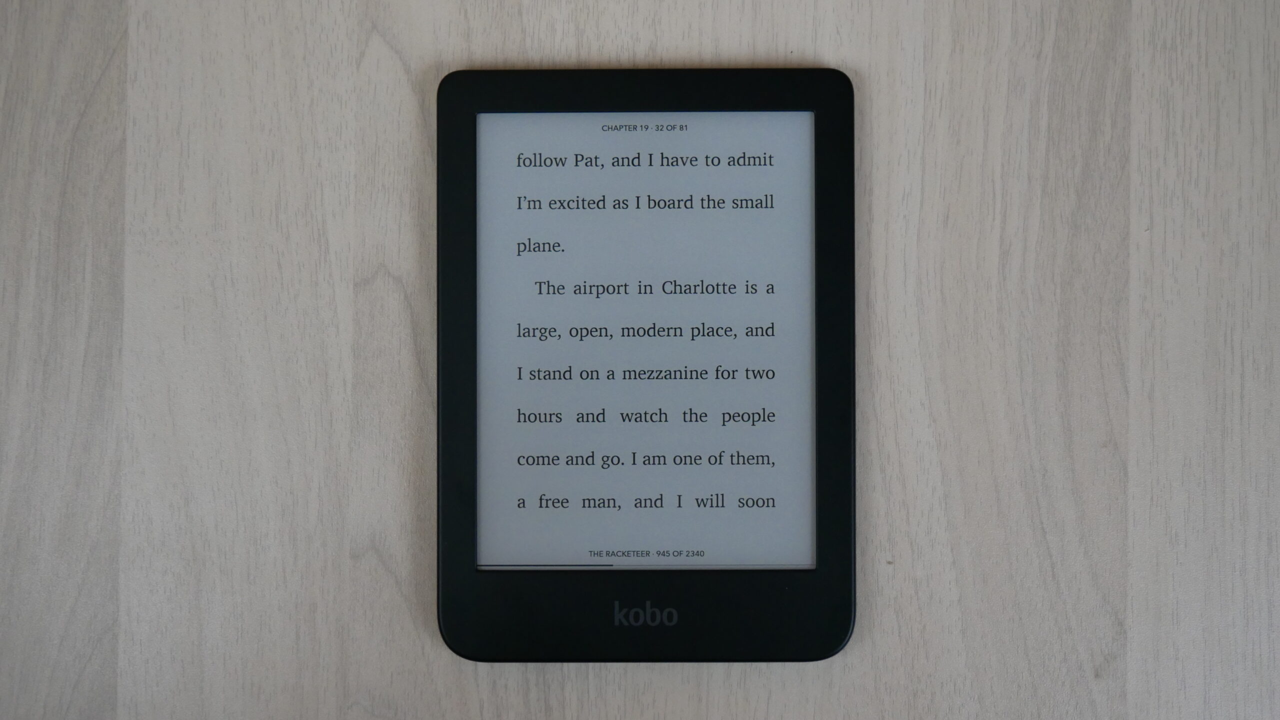
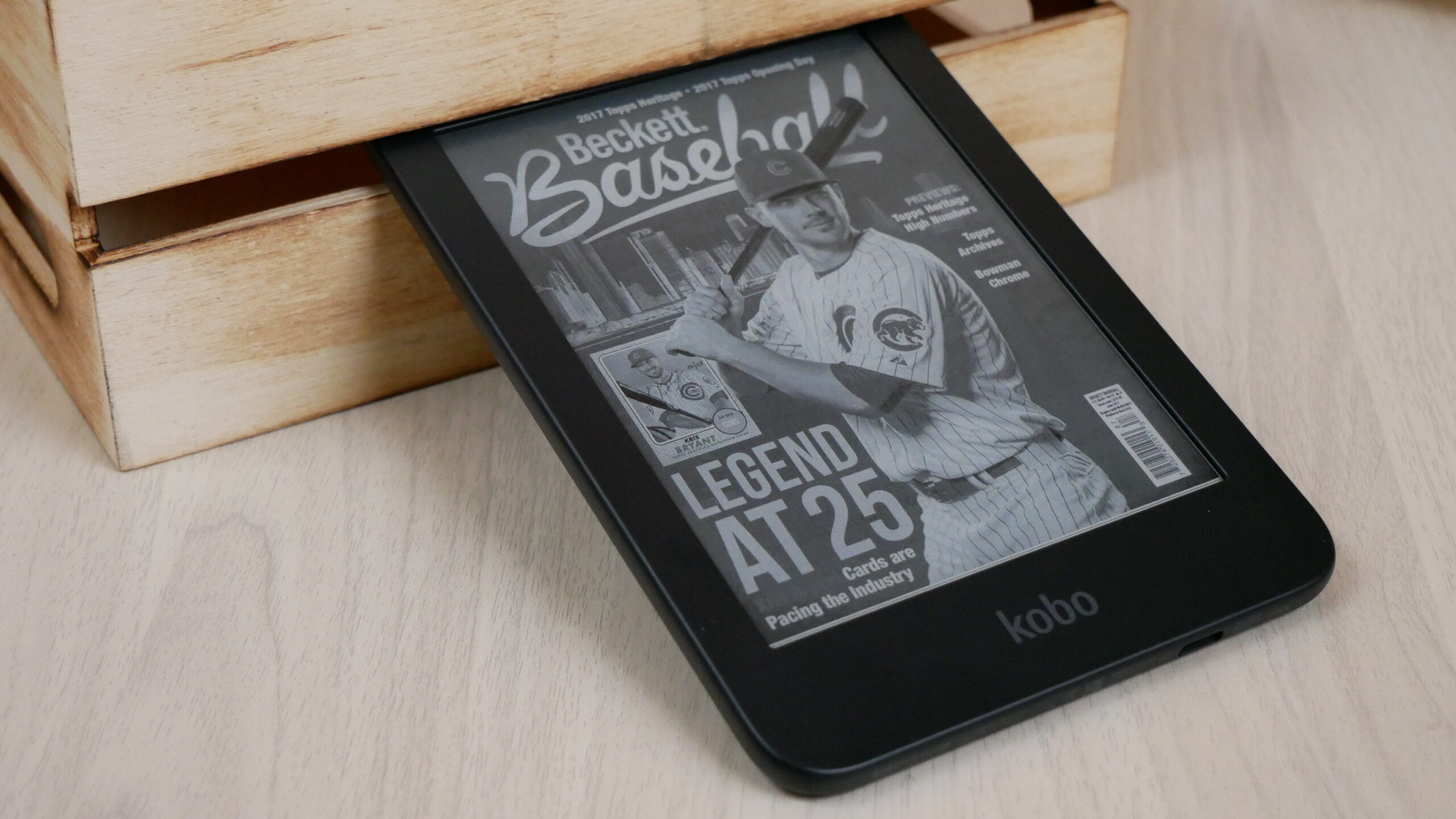
Obviously, the main draw is reading digital content, such as books, graphic novels and manga. It has a sunken screen and bezel design, which makes the text look razer sharp. This is because you are consuming media on exposed e-paper and there is nothing between your eyes and the E INK screen. Many e-readers on the market have a flush screen and bezel design, with a layer of glass. Glass tends to reflect overhead light or sunlight. You can use the Clara 2e day, or night and get a solid reading experience.
Do you like audiobooks? It is the fastest growing segment in digital publishing for the past five years. In the first eight months of 2022, digital audiobook sales were up 3.8% and generated $400.6 million in revenue in the US. The Clara 2e now has Bluetooth, unlocking a new audiobook section in the Kobo Store. Users can access the Bluetooth pairing system in the settings menu and use wireless headphones or earbuds to listen. Audiobooks are still pretty expensive; however, it is a nice feature to be able to use your ebook reader to listen.
Hardware
The Kobo Clara 2e features a six-inch E INK Carta 1200 e-paper display panel. E Ink Carta 1200 delivers a 20% increase in response time over E Ink Carta 1000, and an improvement in the contrast ratio of 15%. E Ink Carta 1200 offers the same benefits as Carta 1000. E Ink Carta 1200 modules consist of a TFT (thin film transistor), Ink layer and Protective Sheet. Kobo has included the capacitive touch panel directly in the module stack.
The overall resolution of the new Clara is 1448×1072 and has 300 PPI. The body is a dark blue, which almost looks black on camera. It has a sunken screen, with exposed e-paper. Reading on this is really good and the font clarity is amazing. This is because there is no later of glass, so it will not reflect overhead lights or sunlight. The vast majority of new e-readers on the market have a flush screen and bezel design with glass protecting the screen. I wish more companies would forgo the glass and go with exposed e-paper. There are a series of white and amber LED lights that are positioned alongside of the bezel and they project light evenly across the screen and not into your eyes. Kobo calls this ComfortLight PRO adjustable brightness and color temperature system.
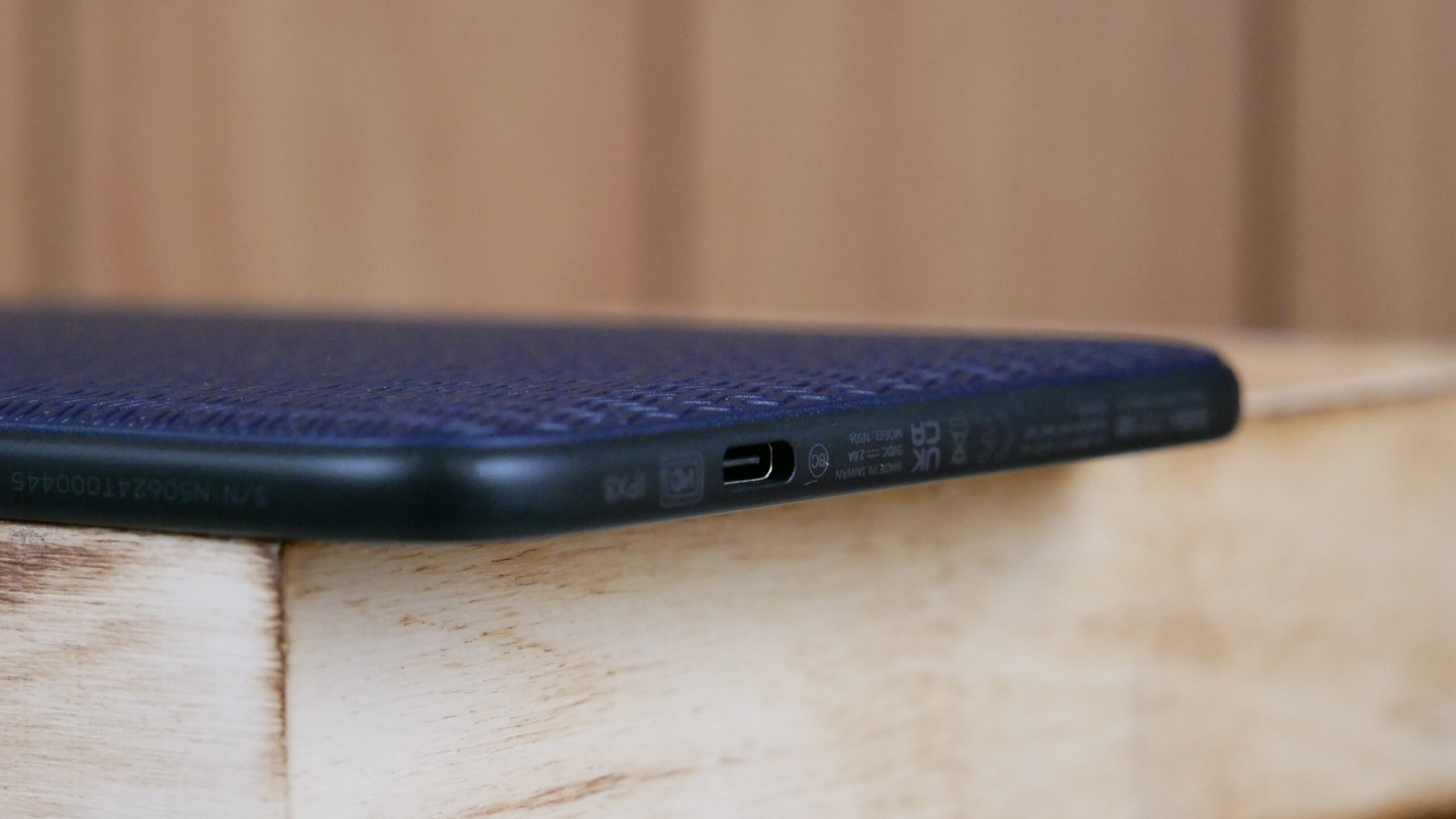
Underneath the hood is a 1 GHZ dual core processor and 512MB of RAM. There is 16GB to house ebooks and audiobooks. You will be able to connect to the internet via WiFi 802.11 ac/b/g/n. This is the first Clara model to have Bluetooth for listening to audiobooks, which are purchasable from the Kobo Bookstore, however you cannot sideload in your own audiobooks. What is most exciting is that it has a USB-C port. It has a protective film inside of the device, which is coated with waterproof material. This will give users the ability to read it in the bathtub or the beach and should not worry about random spills of water or tea. It is officially rated as IPX 8, which should be good for around 60 minutes in fresh water. It is powered by a 1,500 mAh battery and the dimensions are 112.05 x 159.02 x 8.66 mm and weighs 171 g.85
The major selling point behind this e-reader is that the body is made of 85 per cent recycled plastic— including 10 per cent ocean bound plastic, like water bottles or CDs. The retail box is made of recycled cardboard and opens up like a book, similar to a hinge. There is some paper documentation such as quick start guide and warranty information. It comes with a black USB-C cable with small twist ties, that are made of plastic. The Kobo Clara 2e also has a plastic protective covering on the screen. I think Kobo missed an opportunity here with using plastic inside the box. Many companies are now using wax paper to encase the e-reader and protect the screen and USB cables have a little cardboard hoop, instead of plastic ties.
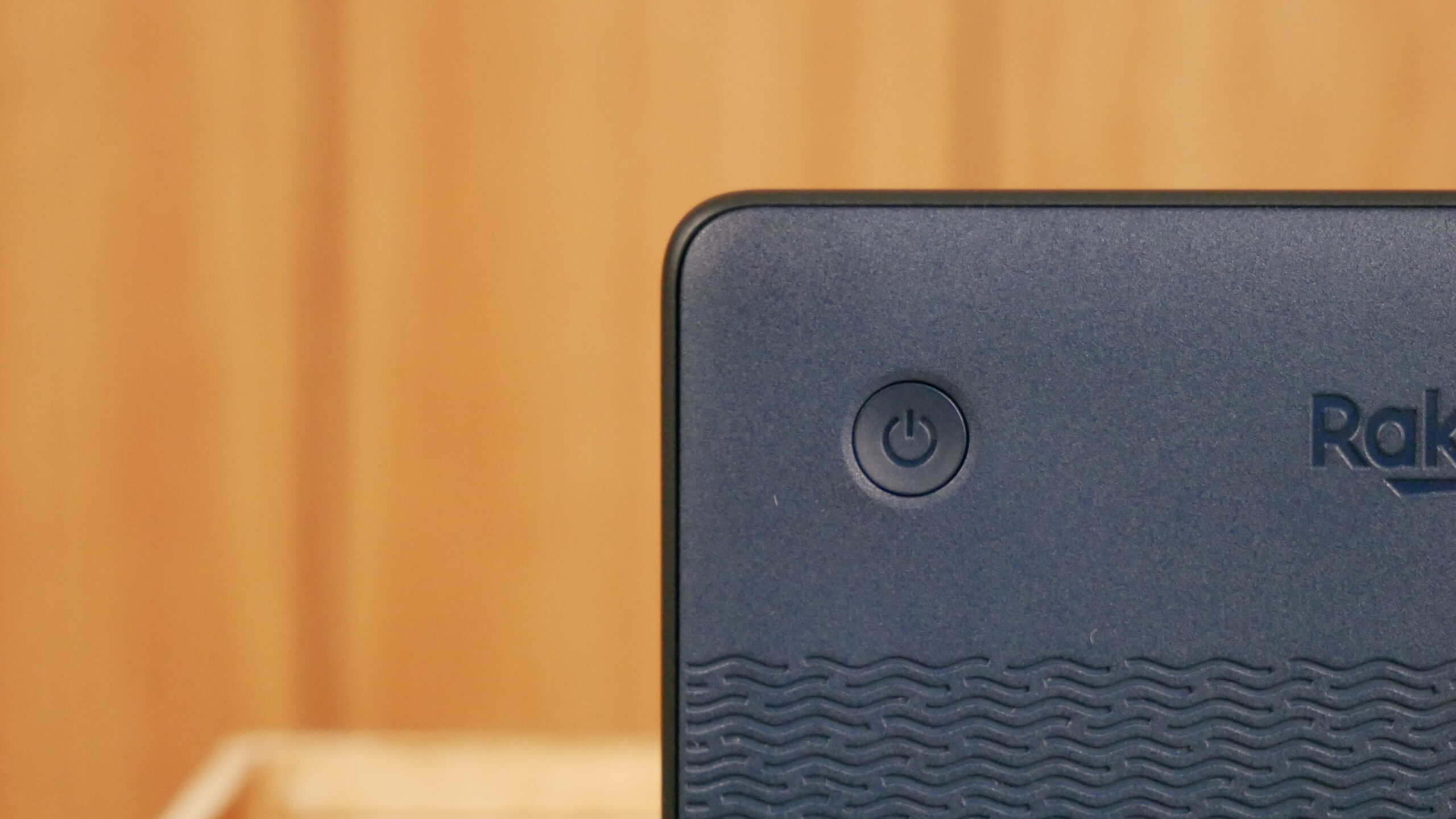
What I like about the Kobo Clara 2e is the position of the power button, it is on the back. This is similar positioning of older Kobo e-readers, it is rare that you would inadvertently press it down, when reading. The color is also compelling, most e-readers are piano black, and this one is a really dark blue. Reading books is the main reason why anyone would buy this, and I think the overall experience is better than the Sage or Libra 2.
Software
Kobo runs a customized version of Linux, instead of Google Android. This allows them to really tailor the user experience for a 300 PPI screen and put a heavy emphasis on making it work really well on an e-ink screen. The Clara 2e software experience is a little bit different than most of the companies other e-readers. The cover art and text on the home screen has really high DPI. The home screen comprises of the last few books you have opened or have purchased and the rest is devoted to similar titles and various links to the Kobo online store.
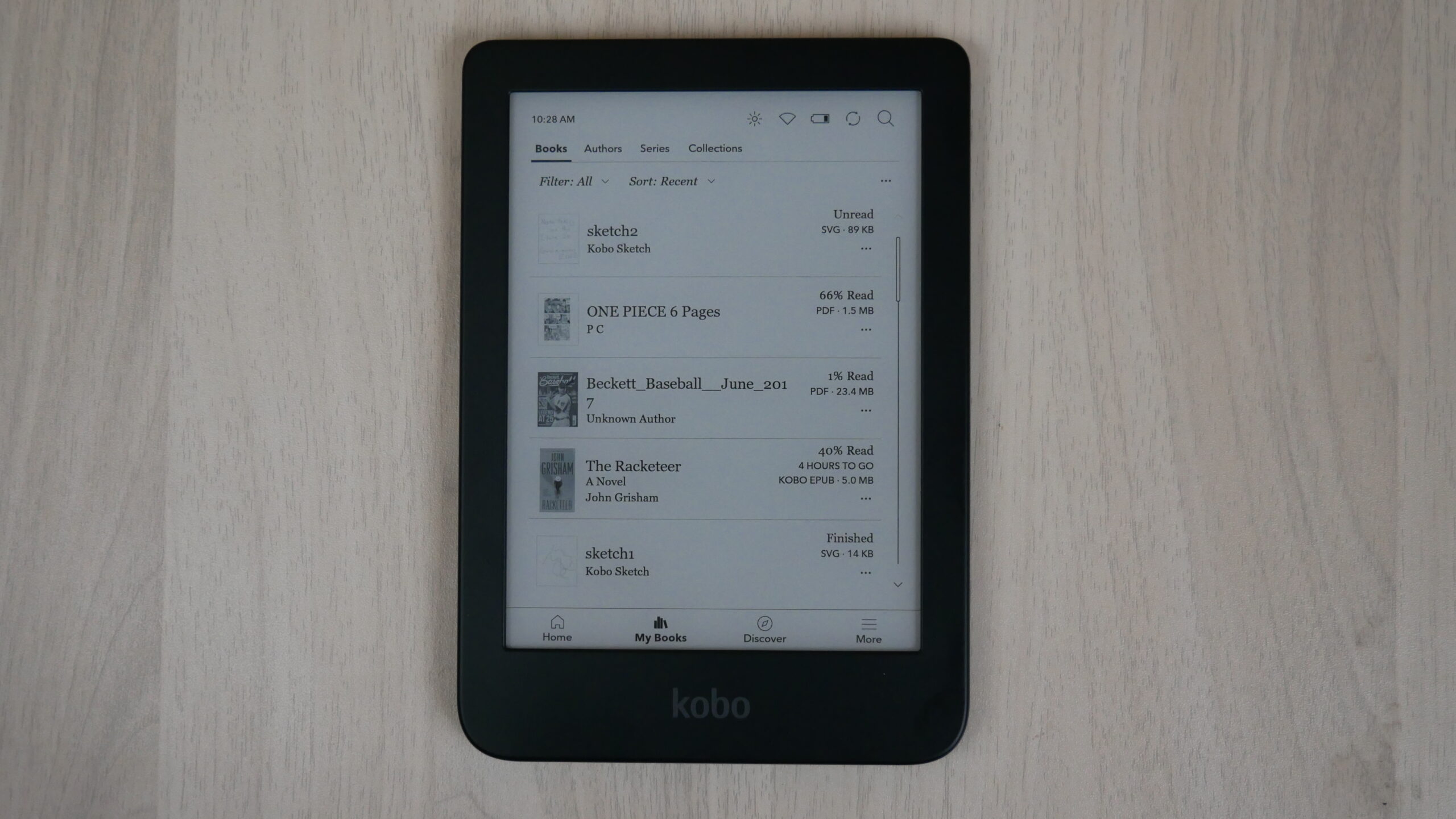
There are a few UI elements at the top of the screen, which are clickable icons. This is where you can access your illumination settings, such as the white and amber LED lights. You can blend them together or use or the other. They are controlled via slider bars, for optimal performance. There are also icons for WIFI and battery life, there is a special power saver mode, which will optimize the light, disable WIFI when not in use and stop syncing for new content. This will extend the battery by a week.
The main UI has four entries on the bottom of the e-reader. They are Home, My Books, Discover and More.
The library menu is basically MY BOOKS and is where you will spend most of your time. There are two main options to display your content, list and cover view. List provides you with the full author’s name and the title of the book and cover mode basically just shows the ebook cover art. You can sort by author, date added or publisher. You can also develop your own collections and pick and choose what ebooks you want to add to it. When you are done reading a book you have the option of leaving a review and the review is automatically entered into the Kobo bookstore. There is also an option to automatically remove the book from your device upon completion to conserve on memory. There is also a new option in the library to browse similar titles, which opens up a little popup bar at the bottom of the screen. You can click on one and it opens the bookstore, but you can also improve the recommendation engine over time by flagging your interest level in a particular author or genre of book.
If you purchase lots of eBooks you will likely be visiting the Kobo store to hunt around for discounts or to browse the latest eBooks. You can access this by the Discover UI tab. There is no carousals or tons of imagery that will slow down your device and contribute to long load times via WIFI. If you click on a book, it instantly loads and you can read the description by turning the pages, instead of swiping down. You can also read reviews and the publisher info. Buying books is super easy. They tend to showcase books in your specific region. You can checkout top picks, categories and recommended. There is a search bar at the top, if you already know what are you looking for.
Kobo has an exclusive arrangement with Pocket that allows you to push website and blog articles directly to your e-Reader. The easiest way to do this is to download the Pocket browser extension for Chrome, Edge, Firefox or Safari. Once you download the extension and log into the service you can begin to push out all of the stories you want to read to your e-reader later and they will automatically be synced. The articles will include any links, pictures or text, but truncate short code and adverts. The Kobo beta internet browser also has a new Pocket plugin that allows you to send any blog articles directly to the Article menu. There is an option to automatically delete all Pocket articles when you have finished reading them on your Clara 2e.
Overdrive is one of the best elements about owning a Kobo. You can use your local branches library card and enter the details in the settings menu. This will unlock a new UI for your local branch. You can browse their curated collections of ebooks. If you find one you like, you can check it out and then read, without leaving your Kobo. You can do it all directly on the device. The vast majority of libraries in North America and Europe use Overdrive to power their digital collections.
There are a few experimental features of note. One is an internet browser, which lets you surf the web. However, it can’t really play videos or audio, and many websites these days have embedded videos in the post, or have an audio version of the news article, which the Clara can’t handle. Large Print mode is also a very useful feature, that will enlarge the text all over the Kobo. This is useful for people who have vision disorders. There is a sketchpad, which you can use to draw with your fingers or take notes with a capacitive stylus, such as the Good e-Reader one. It doesn’t have any advanced features that the Kobo Elipsa or Sage has, but its useful its there. When you save sketches, they appear in your library. There is another relatively new feature called My Words, which will remember and save words you looked up in the dictionaries. Speaking of dictionaries, there are about 7 preinstalled, but there are dozens of extra ones that can be downloaded and installed.
The Kobo Clara 2e is not breaking any new ground, when it comes to the core Kobo experience. If you have an existing Kobo device, there are no surprises with the UI, settings, positioning or layout. Everything is relatively the same, device to device. This is primarily aimed at their e-readers, such as the Nia, Clara, Libra 2 and older models.
One of the strengths of Kobo is the continued support for older models. We live in a world of planned obsolesce. Normally you can expect firmware updates or new versions of the OS, for about four to six years, after it originally came out. Apple does this with the iPhone, Google with their Android smartphones, the Nook and even the Kindle. Whenever Kobo issued an update, its optimized for virtually every single e-reader they ever made, excluding the Kobo Mini. If you bought a Kobo in 2013, it is still supported today.
E-reading
Kobo does an amazing job in making their e-readers appealing to both casual and hardcore users. They have plenty of advanced options that the competition simply cannot match. One of the most popular is having the ability to load in your own fonts. This is useful if you want to load in stuff like Bookerly or Ember, two fonts Amazon developed with e-readers in mind.
Most e-readers and e-reading apps have a few different pre-set options to change the linespacing, margins, or font size. Kobo does things differently; they also have a bunch of sliders that allow unparalleled flexibility in determining how much weight you want your fonts to have and configure the margins and line spaces. There is also advanced options that allow you to see a before and after side by side that shows you how all of your customizations will look, compared to the existing settings.
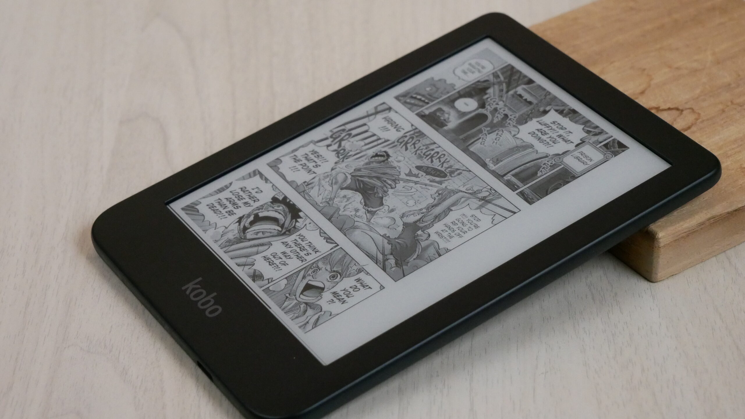
The Kobo Clara 2e was designed to excel at reading the two most popular electronic book formats, PDF and EPUB. They also have support for manga, graphic novels and comic books with CBR and CBZ, so users will be able to download them from the internet and easily load them on their reader. When it comes right down to it, it reads: EPUB, EPUB3, PDF, MOBI, JPEG, GIF, PNG, BMP, TIFF, TXT, HTML, RFT.
When you are reading a book, you have a number of options you can employ. Aside from font and customization options you can long-press on a word and get an instant definition of it. If you speak another language, you can look the word up in Japanese, Italian, German, Dutch, and many more. When long-pressing a word, you get an anchor that will allow you to select a single word, sentence, or entire paragraph. You can then highlight it or add a note. When you add a note, a virtual keyboard appears that allows you to manually add one.
There are also a few other notable options. You can monitor your reading progress with a dedicate button on the bottom of the screen. It tells you how much time remains in a specific chapter and the estimated duration on when you will complete the book. Some e-reading apps have this at the bottom of the screen while you are reading a book, I like how Kobo makes this optional. Speaking of optional, there are also settings that allow you basically turn off page numbers, and everything like that, so it just shows the text on the screen and no other progress indicators.
The Clara 2e has a rapid page turn engine. You can turn this feature on by going to the reading settings menu and choose to turn pages by tapping or swiping, or by swiping only. This new system is great, it allows you to tap your finger rapidly on the screen or gesture and it will change the pages very quickly. You can also hold your finger down on the screen and it will also turn the pages. The text is basically unreadable when the pages are being rapidly turned, will have to release your finger from the screen in order for everything to be fully rendered.
The rapid page turn engine works with KEPUB eBooks, which are books you have purchased directly from Kobo. It does not support CBR/CBZ or classic EPUB support. It is also incompatible with sideloaded EPUB books.
“Our main goal is to empower people to read more, whenever and wherever they want. With that, we challenge print-loyal booklovers, and their friends, to try digital reading for just one week. We know technology of any kind can take a moment to get used to, but we have made eReading easy, and are convinced they will find they can fit reading into even more parts of their day, whether it’s waiting for the kids at soccer practice, during the lunch break, or during their daily commute. If it’s not for them, which we which think is very unlikely, we’ll happily take the device back, no questions asked. In past discussions with print loyalists who took the challenge, they told us they got used to using the eReader by day two or three, and most said they would use it as a complement to their existing reading life,” says Michael Tamblyn, CEO, Rakuten Kobo.
Wrap Up
The Kobo Clara HD was one of the most popular e-readers, it went head-to-head with the Amazon Kindle Paperwhite in terms of price and features. Kobo really hit a homerun with this model. It has USB-C, audiobook support, E INK Carta 1200 display, 300 PPI, made of recycled plastic and is a pure joy to read on. If you have the original Kobo Clara HD, I would buy this, since the HD model is really long in the tooth.
How does the 2e compare to the competition? I would say now its closest competition is the all-new Kindle Basic, the Barnes and Noble Nook Glowlight 2e, and the Onyx Boox Nova Lite. There are pros and cons of each model. The new Kindle only has four white LED lights, while the 2e has around 27 white and amber LED lights. The advantage the 2e has over the Nook, is the Carta 1200 display and Kobo has language support for close to 20 different ones, while Nook is really only relevant in the US. The Boox, is a bit more expensive, however it does have Android and Google Play, so it is a bit more agnostic in the types of ebook ecosystems that are supported.
I think the Kobo 2e might be one of the most popular e-readers of the year.
(adsbygoogle = window.adsbygoogle || []).push({});
The post Kobo Clara 2e e-reader – Hands on Review first appeared on Good e-Reader.

